Crooked River Beer Can Design
Brief
Research
Crooked river
To begin research I decided to find out more about the brand.
Current beer can designs
Competition
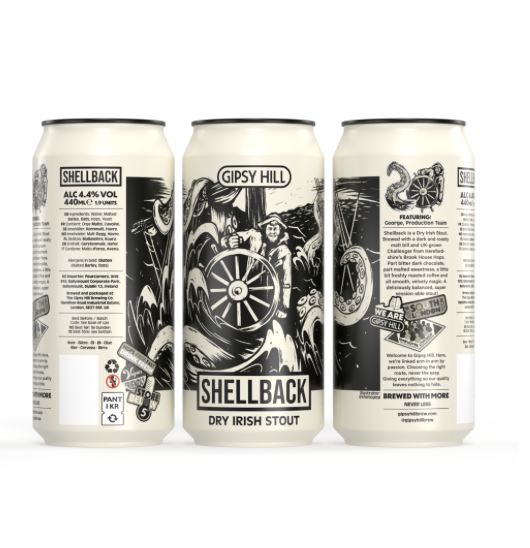
I started looking at some if the beers that will be sold next to crooked river as one of the important things about this product is it needs to stand out and look better than other beers so that when people who aren't that knowledgable about beers come to purchase these products they will choose it based on packaging.
I looked in some shops to see which craft beers stood out since I will want the crooked river beers to stand out when beside existing cans.
moodboard
Thumbnails
Collage
I created some vibrant collages as I thought this would be a cool abstract design for the can.
Although these cans are very abstract and colourful I didn't think they were eye-catching enough. They were still a bit plain and boring.
I decided to add some characters however these cans started to look too busy.
I started playing around with this idea making more collages to try an make it look less busy
The designs were looking too busy so I experimented back with just colour instead of patterns and type.
Type collage
Developing finals
I was leaning towards the more vibrant designs as I felt these looked best and would stand out on a shelf.
Hoppy Pilsner
Cold IPA
mango passionfruit sour
Final designs
I chose these designs because I felt like each one showed the flavour of the drink through an abstract way and through colour. Plus I feel like they would be eye-catching on a shelf due to the bright vibrant colours used.


