ISTD Project
Brief

Book Choice
Alice In Wonderland is the book I have decided to choose.
Research
About the Author
Interestingly I found that the author of Alice in wonderland based Alice on himself since he suffered from a rare neurological disorder which caused hallucinations and makes objects appear bigger or smaller than they are. This disease wasn't discovered until 1955 and was named Alice in wonderland syndrome.
1865
This book was published in 1865. Therefore I decided to look at design styles and events from this time period to see if it could influence some of my design choices. I really liked the decorative type as it gave a fantasy feel and Alive in wonderland is a fantasy book so it works well.
Type inspiration
I started looking at some type inspiration. I looked at ideas which could show the idea of the movement in the story.
Designers
|
Kevin Steele
|
Marion Bataille
|
|
|
|
Paper mechanisms
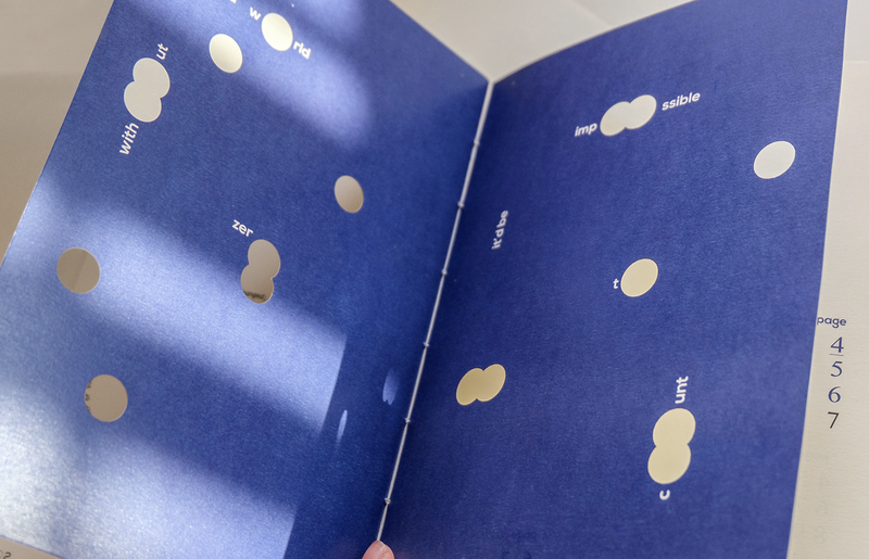
Since there is a lot of movement in the book I wanted to show this through the type moving through turning the page . Therefore, I looked at some paper mechanisms examples.
|
|
|
Typography
I wanted to find some typography which seemed quite mad and crazy with shapes and movement as I felt that would fit the story most.
Books
I looked at some books to get some layout inspiration and learn more about design from the 1860s
Binding
I did some research on binding to get an idea of how my book will be held together.
I attempted to create my own binding using sticks. However I didn't like the final look so I don't think ill be using this for my final idea.
Glyphs
I decided to look at some glyphs. I wanted to make emphasis on how Alice is hallucination and her mind is playing games. Therefore, I wanted to make the front of my book similar to that of a playing card.
Body copy
I started testing out my body copy by printing it out to work out which was the best size and typeface. I tried it in sans and sans serif.
Thumbnails
Development
Front page
I began testing out the cover with card on my Cricut.
I tested out the mechanic of the page however, it didn't go great yet helped me when I did it the second time.
I started with a black cover but the black hallucination got lost so I tried a red cover instead however I didn't like how this looked so decided to change the colour of the hallucination to red instead to make it stand out. Also after testing I realised that the front cover flapped around a lot due to the middle of it not being attached to anything therefore for the final piece I decided to use acetate to keep it from getting damaged.
I wanted to use a spiral with the word down going around it to imitate Alice falling down the tunnel. Luckily my first attempt of this pop up worked so It was more figuring out how to style it for the book.


